The client
Worcester State University is located in Massachusetts. For 140 years WSU has been a teaching university focused on liberal arts and science, with over 6000 students.
The project
 Worcester State is Lancer Nation. So when they came to Opus Design of Boston wanting an admissions piece takeaway it was no surprise that there was a lancer involved. We used their mascot, the Lancer, and designed a fun die-cut handout with the mascot on the front side, and important admissions information on the back.
Design challenge and approach
The challenge for designers is organizing the amount of information given, giving it hierarchy and showing off the hero of the piece. Sometimes it’s clear the hierarchy and sometimes it’s not, the client should always be asked what is the hero of the project. For this admissions piece the hero is the place to apply and the dates to apply by. Not only did Sr. Designer and Information Design Specialist, Emily Knapp organize the content with hierarchy, she designed it on the lancer shaped cut-out in a way that is appealing to potential students. The university did have clear brand guidelines, so that determined colors, style and font. Take a look at the admissions piece.
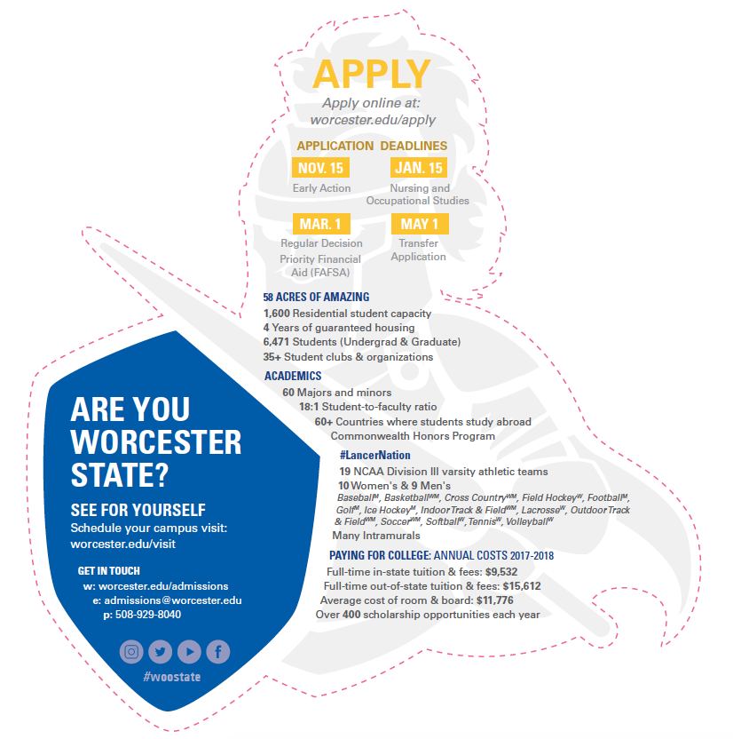
The important information is first where and when to apply, interesting factoids are next and then on the shield a stand-out question to engage the audience. What will engage the potential students even more will be the type of paper. They will have the printer make the front side engaging by having raised spot UV applied to parts of it.
The clients loved the admissions piece. Go Worcester State!