Youth voting data visualization
We were thrilled to work with CIRCLE on this custom data visualization and interactive infographic that allows users to explore youth voting and civic engagement and to learn about the conditions that shape youth engagement.
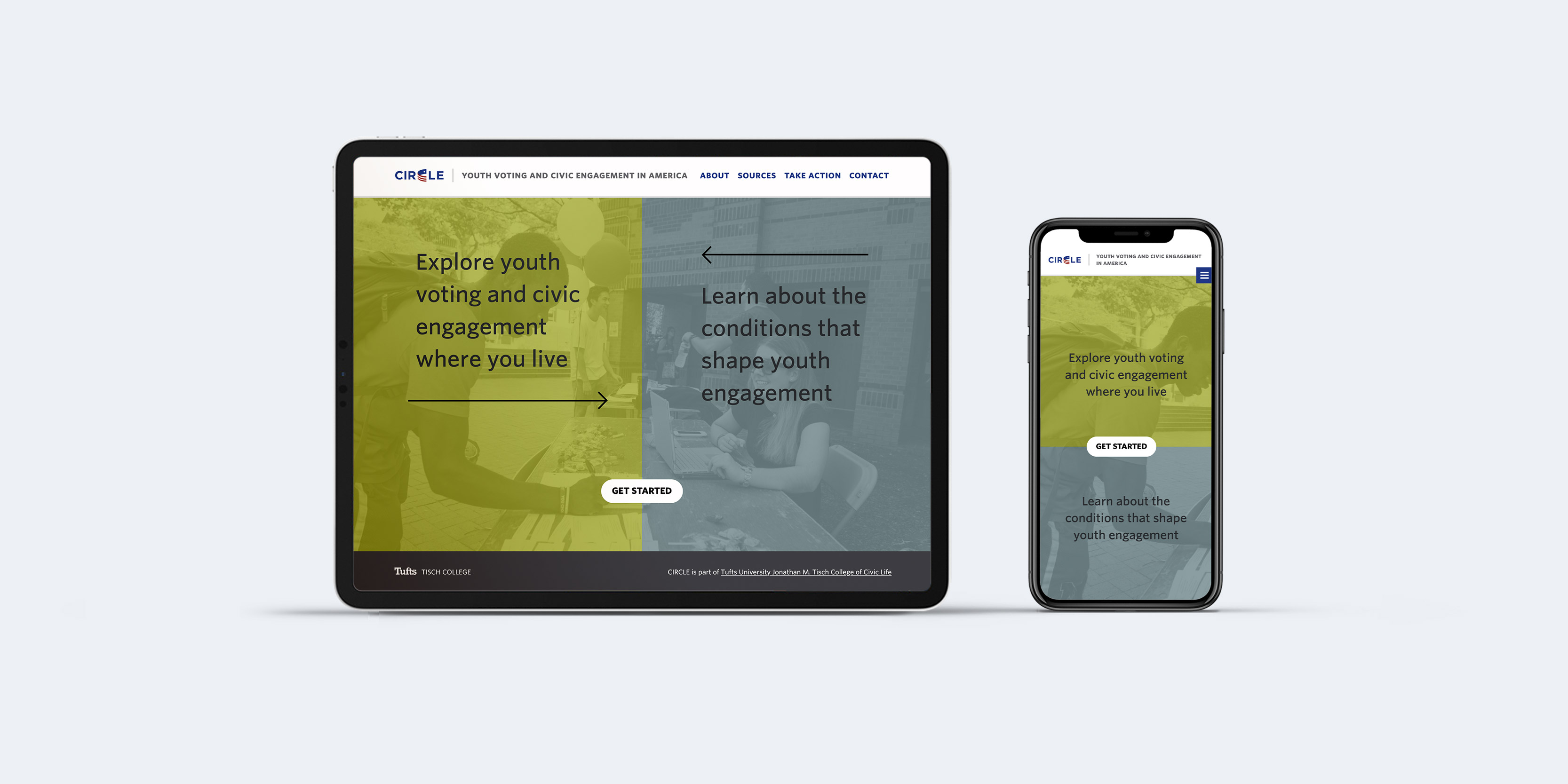
A custom data visualization means exactly that, completely custom, nothing like it exists. We started by reviewing all the amazing data the CIRCLE team prepared and collected for this tool, understanding structures, and goals and developing concepts. Based on these concepts we prepared wireframes to start testing how the data can be accessed and laid out.
Our goal was to provide the data and lay it out in a way that suggests a correlation between youth engagement and community conditions.
Featured on CNN
On September 22, Abby Kiesa, Director of Impact at Tisch College’s Center for Information & Research, was interviewed on CNN with John King to talk about youth voting in the upcoming election.
User experience and user testing
With a custom tool, user testing is extremely important to make sure the new interactivity is user friendly and intuitive. We tested the wireframes with users from the target audiences and got great feedback that helped us further refine and improve the tool.
Visual design and infographics
The design of the tool is accessible and responsive. Data charts, icons, factoids, maps, and tables had to be designed to visually communicate the data clearly. The complex data selection provided an interesting challenge that our art director Casey resolved beautifully.