Tufts University Equity in America
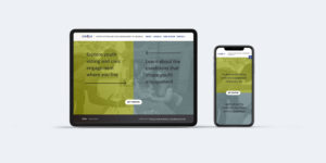
The data visualization and website design, “Equity in America” invites users to explore equity and inequity in health, wealth, and civic engagement in the USA. The tool visualizes the data of a study by Tisch College at Tufts University.
One of the guiding goals for the website design was to clearly and visually present the data for the user to draw their own conclusions, versus guiding their opinions. Among many other equity topics, timely data is included for users to explore populations groups and COVID19 — how race, age, gender, civic engagement, employment, healthcare, or income may influence the likelihood of getting the virus.
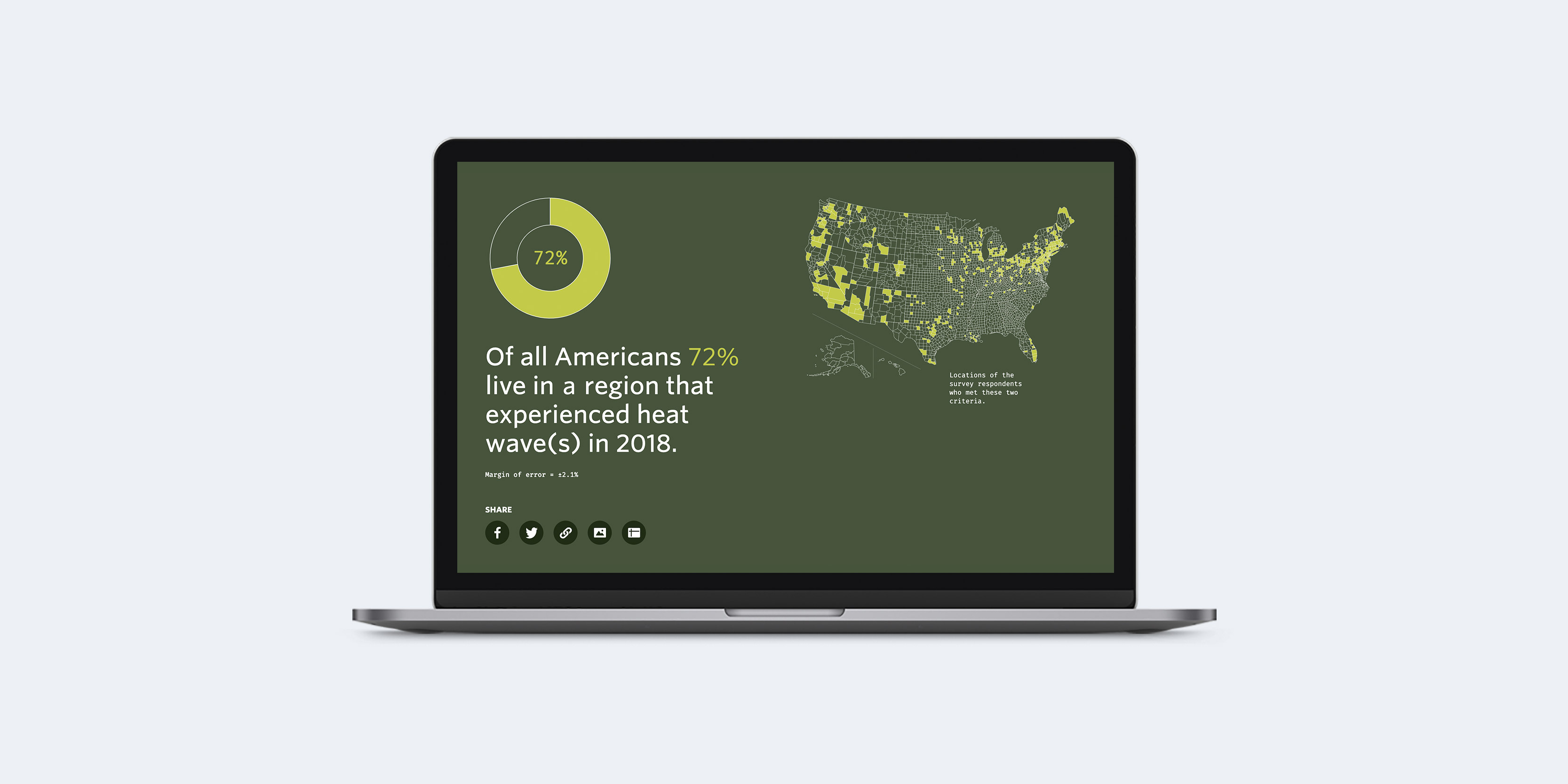
Data charts and download
A simple pie chart shows the percentage of the population for every data combination along with text which creates accessible information for all audiences. The map that is displayed for each data point shows where the respondents live in the US, to provide geographic context. The data can be downloaded, shared, or saved as an image to make it easy to use in presentations or other purposes.
Research briefs
The “Research Briefs” section on the website allows the research team to post articles that put the data into perspective. They share additional data related to different equity topics such as the research Brief “Only 57 percent of Americans say they would get COVID-19 vaccine”.