Full suite for startup home inspection business
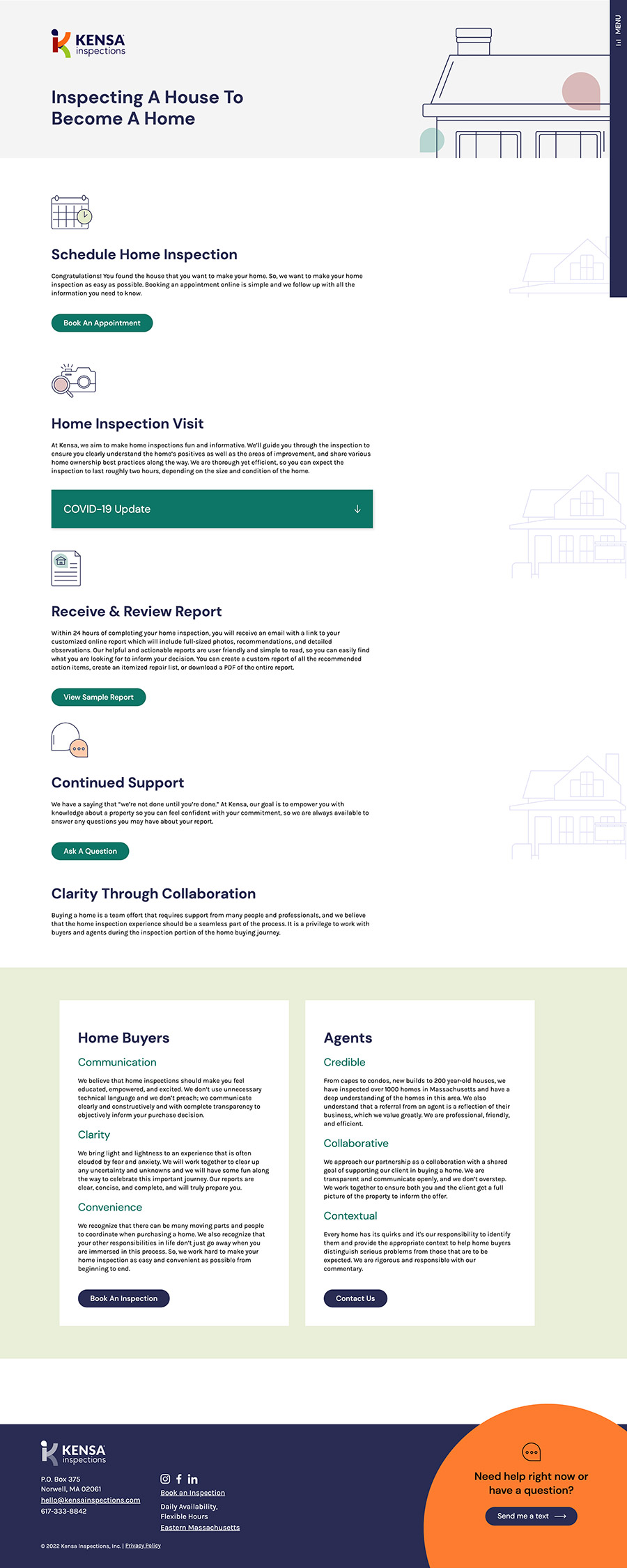
The founder of Kensa Inspections came to us with a dream to start a new kind of home inspection business — one that embraced the possibility of sincere collaboration between home inspector, home buyer, and real estate agents. He also recognized that his role was bigger than inspecting electric boxes and plumbing; he was helping folks make an informed decision at one of the most major milestones in their life — buying a home.
The founder’s passion and positivity was infectious, so building the brand strategy and launch assets was an absolute joy for Opus. We love helping good people do good.
ken · sa
Through a comprehensive and methodical process, we identified a company name that best reflected his vision and most resonated with his target audiences. Because collaboration and inclusivity were so important to Kensa, we took inspiration from cultures all around the world to build a bank of almost 300 possible names for this home inspection business. We whittled the list to those that had the most meaningful connection to the company’s purpose, and tested with the target audience.
The final name, Kensa, has many meanings across the world that speak to what they do – from the literal “inspection” translation in Japanese to the combination of the founder’s name and “sa” in ancient hieroglyphics, which has symbolic meaning for protection.
Logo design
Along with the overall visual identity, we created a distinctive, memorable logo. The vibrant colors mimic the colorful personality of the founder, Ken, while still portraying his professional nature. The fonts are rounded and approachable, which was important to convey the collaboration element that is central to the brand. The teardrop shape above the “K” can be read as the head on a person, reaffirming the humanity of Kensa, or also as a comment bubble to give nod to the inspection process.
Opus and did a fantastic job guiding me on the path to discover my company voice, name, market positioning, outreach strategy, and more. They spent a lot of time understanding the home inspection landscape from scratch and were deeply thoughtful about their approach and contributions throughout. In some ways I consider Opus to be a co-founder of Kensa Inspections.
Comprehensive brand guide
This comment bubble graphic element is repeated throughout Kensa’s print and digital marketing materials. We built a comprehensive brand guide with recommended usage styles for this element and other custom illustration elements, along with a full overview of the brand strategy work and visual identity.
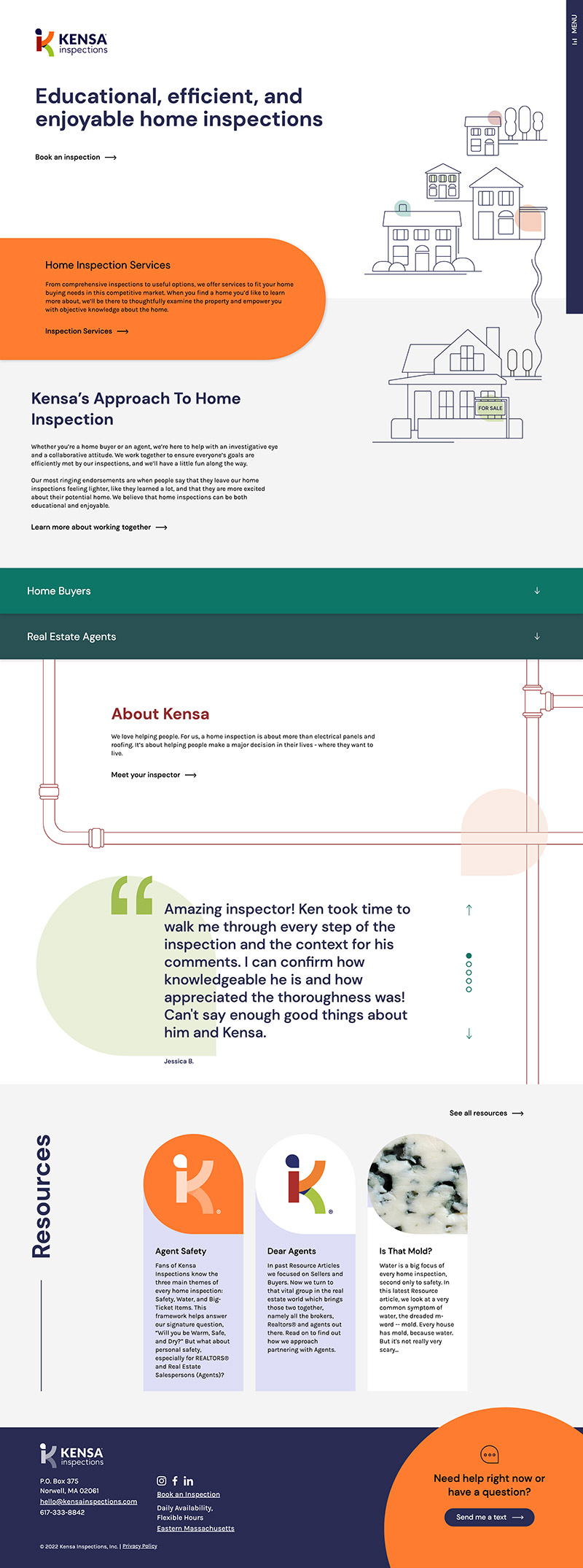
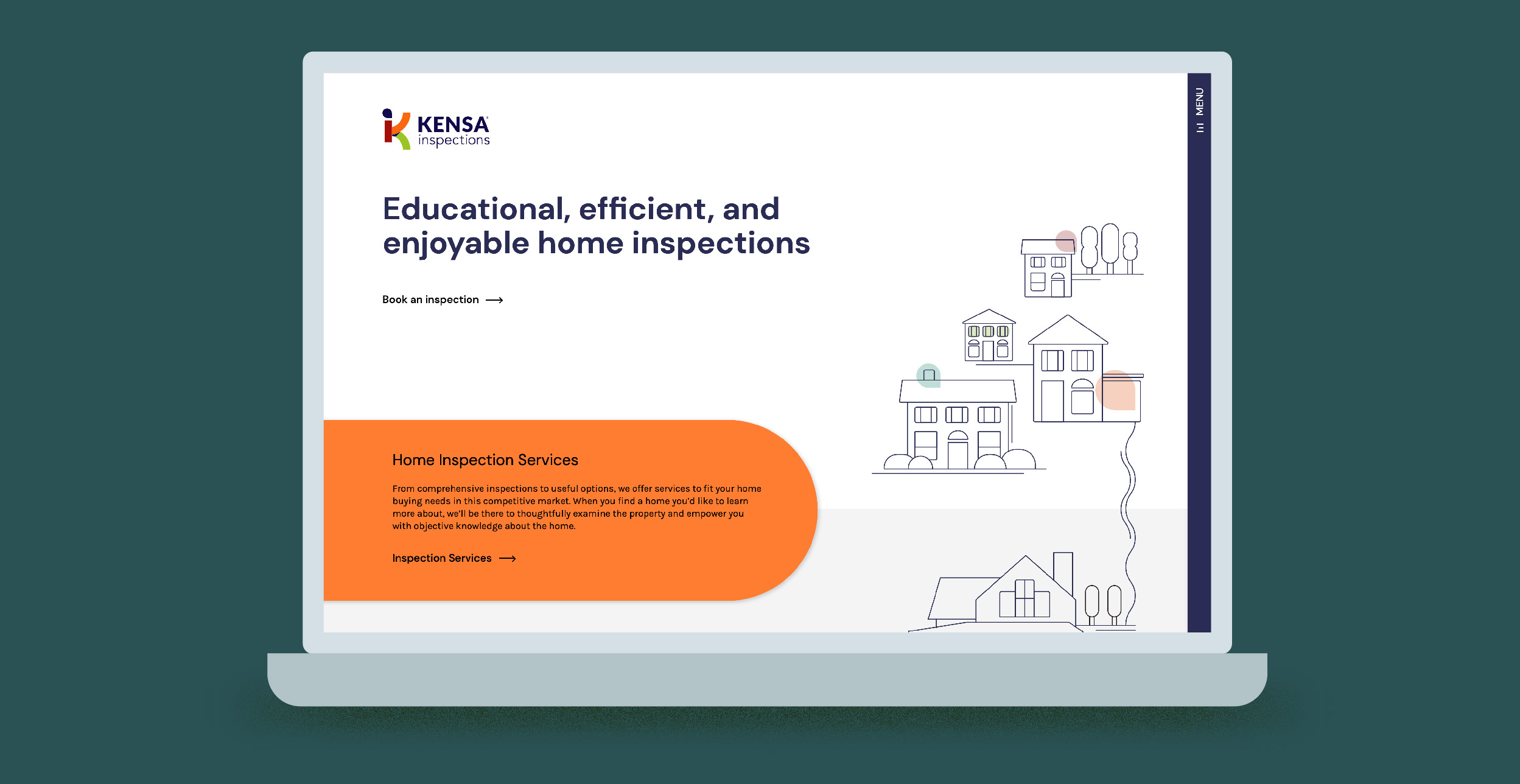
Website content
We worked closely with Ken to understand the waters in which he swims before diving into copywriting (pun intended). We conducted interviews with target audience members to determine key points of difference and messaging that would be impactful, and recorded a few conversations with Ken himself – who is a remarkable storyteller and is known to have a few clever catchphrases – to use as inspiration.
We also researched the competitive set to map their key messages to ensure we were not only covering all of the key points that users might be looking for on the site when comparing Ken to others, but more importantly identifying how Kensa could stand out from the crowd.
We then took all that we learned and helped Ken shape the content that would be needed for the site. We built cloud-based documents for easy sharing and collaborating, outlining exactly how much to write for which sections and which key points we needed to address and where on each page. Once we had a solid plan in place, we wrote in a tone of voice that would feel authentic to his new brand and helped to load the content into the back end for launch. The WordPress CMS offers quick and easy copy editing going forward.
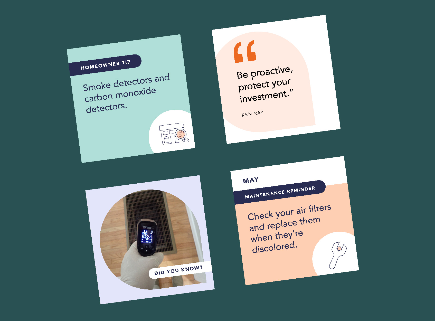
Social Media Templates
Kensa knew that social media was going to be important for building brand awareness and staying top of mind with one of their target audiences, local realtors. We worked with them to create LinkedIn page and personal banners, profile icons, and custom branded social templates, built in Powerpoint for simple editing, that are versatile enough to use for multiple purposes across multiple social platforms to create professional branded online presence.