Logo & packaging design for wellness shot brand
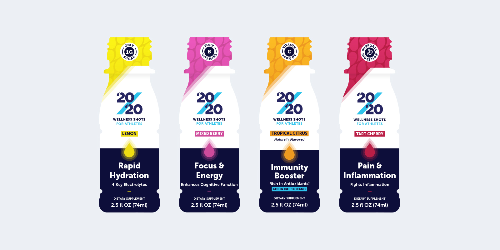
20/20 is an exciting emerging brand that has developed a line of scientifically-backed wellness shots unlike any other. Their mission is to empower people to perform at their best in their everyday lives and to help athletes consistently perform at their peak. Since this was a breakthrough concept in an otherwise crowded category, we helped the founder identify and articulate his higher purpose and the persona of the brand he was seeking to create so that his wellness shots could successfully stand out from the pack. This process of pulling back and thoughtful reflection established a strong foundation in brand identify.
Building from purpose and persona
The name 20/20 was inspired by the founder, in part, by the belief that clarity and focus are critical in optimizing our performance in any activity. The added complexity in this logo design was to not only make sure we were best reflecting the true essence of the brand but to also mitigate any unintended association with the calendar year or other pop culture references. This was achieved by creating the droplets in the twos and using blue to help describe beverage and slash to demonstrate energy and performance. And, we did an extensive scan of other public representation of the number to ensure our logo design was unique.
Standing out in a crowded field
The category of wellness shots has grown significantly in recent years and many new brands have entered the market. As such, it was critical for us to intimately understand the competitive landscape so that the packaging design would ensure 20/20 stood out in a way that quickly captivated and engaged target consumers.
Communicating the right information
With such a small surface area, we needed to make some difficult choices about what information consumers most needed to be inspired to purchase. We mapped out many different communication hierarchies and thoroughly evaluated the pros and cons of each before settling on the final version. From there we created a packaging design that optimized impact, that created variety separation across skus, and that properly accounted for all relevant regulatory requirements.