Educational infographics for Groundwater Guardians
Groundwater Guardians is a collaboration of professionals working to engage residents, visitors, and fans of Cape Cod in making clean water available for everyone. They hired us to design an infographics series to educate the community on topics such as aquifers, the importance of nitrogen and phosphorous, and emerging contaminants in drinking water. GG struggled to make these technical topics clear for the public, so it was our job to learn, help simplify and visualize!
Infographic design process
The process started by meeting with the client to read one “script” at a time, out loud. This gave us all a chance to listen with our ears and visualize what we were hearing. We could ask questions and learn more about the topic being read. We’d often find ways to simplify the technical language, to make it more clear and simple for us as non-scientists, to read and comprehend.
We then create a design which shows the mapped content using icons, illustrations and other graphic design elements. Once again, we do a live review to discuss feedback, changes the author might need, and how to improve. We’ll often iterate 1-2 more times until the design is complete and approved.
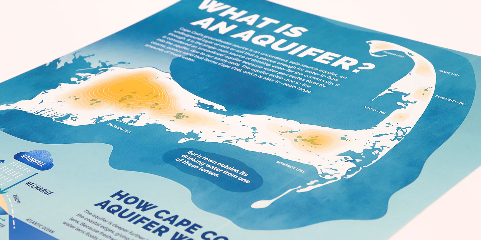
Infographics series
All of the infographics were connected through the same cohesive style. Some of the posters we designed were “model” graphics showing how something works as a system; such as “What is an Aquifer?” Others show a comparison of information such as differences between waste water treatments or different types of wells. Showing something side by side helps people digest complex information. In all of our graphics, there were “factoids” or data that we pulled forward with icon design. These small bold graphics can grab attention and break up dense content when needed. They create a pattern and rhythm in the main section of the “Drinking Water” infographic