Educational material design for Boston Athenæum
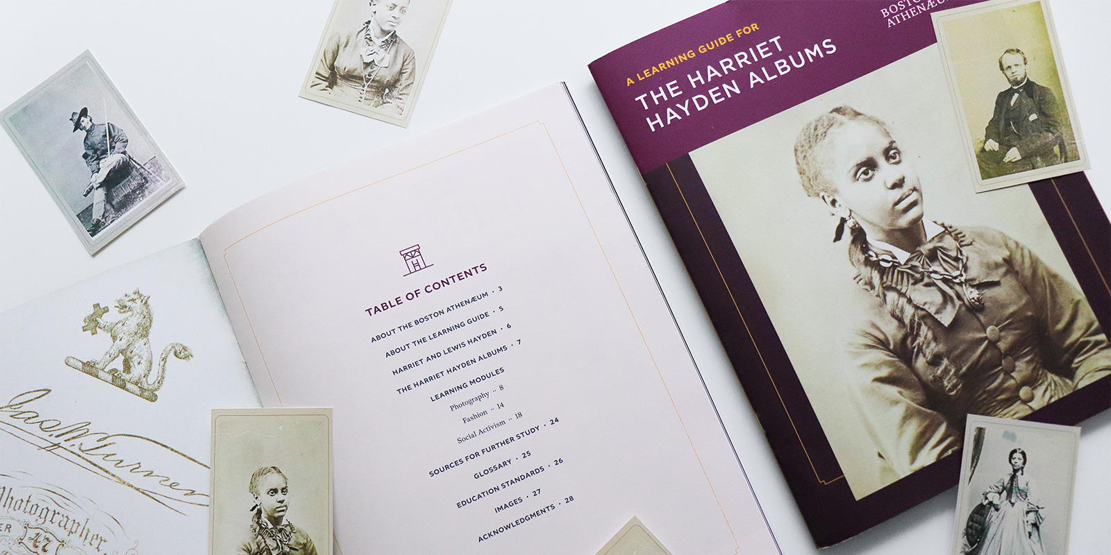
The Boston Athenæum is one of the oldest independent libraries in the United States, founded in 1807 by the Anthology Club of Boston, Massachusetts. We were excited to collaborate with the Athenæum on a learning guide print piece for one of their new exhibits, The Harriet Hayden Albums, which was designed to help educators build lesson plans around the exhibit and library visit.
Creating a design system
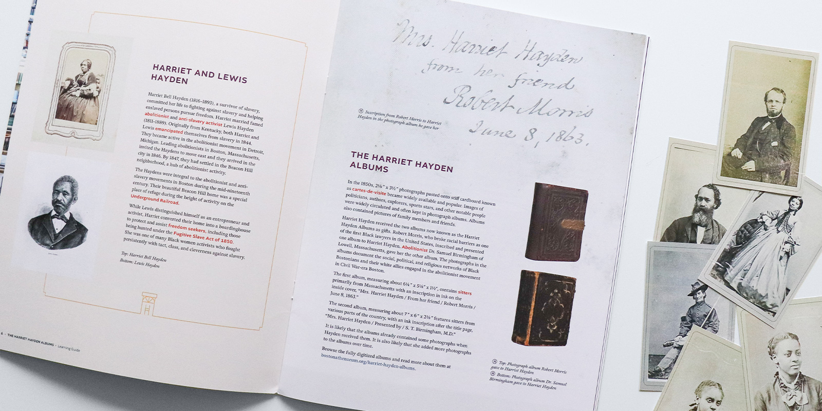
With many years of experience in the education sector, we helped to visually organize the learning materials within the guide so that they would be easy to follow for both the educators and the students. We did this by creating a design system for each of the elements in the piece including:
- Consistent learning module spread design
- Key word treatment linked to glossary
- Question prompt callouts
- Custom icon as an indicator for the photos that were a part of the album exhibit
Consistent visual styles and tools like this help the user understand where they are in the document, easily scan for what they need, follow the flow of the hierarchy in which it was intended, and ultimately have a positive experience interacting with the piece.
Print + PDF
This piece was originally designed to be physically printed on an uncoated sheet so that the book would be easy to write in without smudging ink. Later, we identified opportunities for digital interactivity so the user can easily explore the recommended reading and view exhibit photos and details on the Athenæum website.
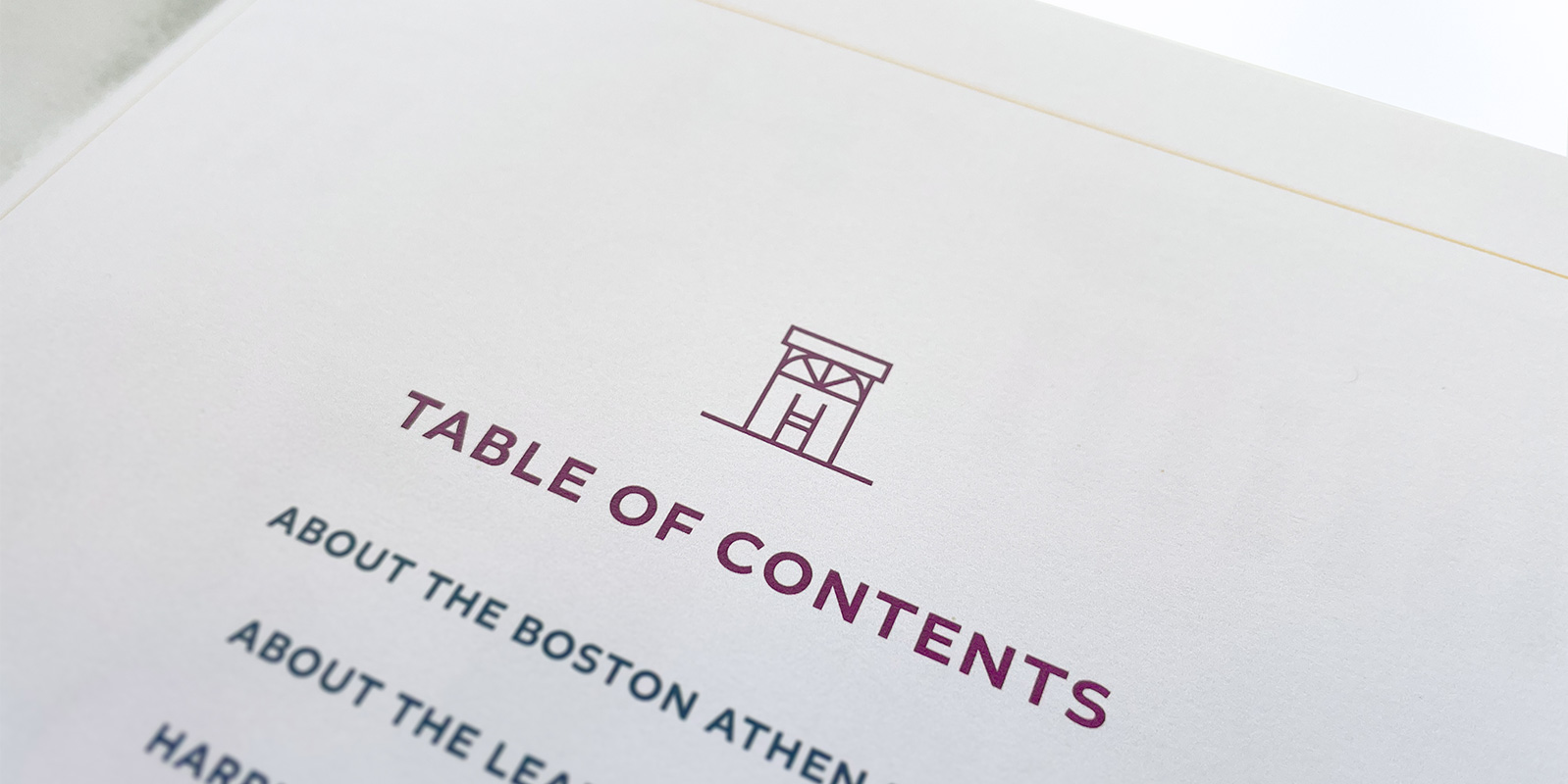
Meaningful and Functional Icon
The album is a collection of photos from Harriet Hayden, so we used her initials (HH) and combined them with a simplified outline of the doorway of her historical home to create a simple illustration, seen here with the contents. We simplified the icon to the “HH” treatment inside of a circle, which was used as a visual indicator for images in the print/pdf guide that were also part of the live exhibit.