OpenType features in typography allow us to customize the tone of a message.
We already know that typefaces are much more than just letters and numbers in different styles. By utilizing different classifications, weights, and variations, we can use fonts and typefaces to completely change tone and message of what is communicated. But there’s additional things to keep in mind when typesetting besides its general appearance. You might have heard of OpenType font files, or at least seen the .otf ending on some of your fonts. On the surface, you might not think the OTF files make much of a difference, but in reality there’s a whole world of special features that these files have. Whether you’re typesetting short pieces of text or long, information-dense reports, these features can help perfect even the smallest typography details. Here, we’ll highlight some of the most commonly used OpenType features—but the list goes on and on from here!
Small caps

Small caps are just as they sound—small capital letters. These capital characters reach up to the x-height rather than the cap height.

Better fitting in with large bodies of text, small caps can be most helpful for longer strings of capitals (like abbreviations) to provide less of a visual disruption than a string of full-height capital letters.

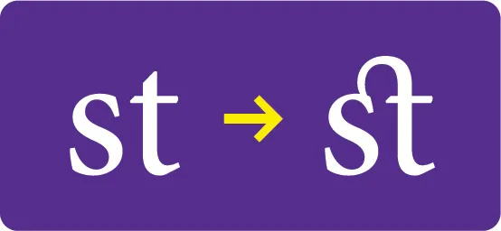
Ligatures

A subtle but necessary feature, ligatures are alternate glyphs that connect two (and sometimes three) characters to make the visual flow much more natural. The best example of a ligature is between the letters f and i. When together, but not through a ligature, fi can have visual tension based on the typeface. In many serif scenarios, the terminal of the f can get really close to the i, or even touch it. With a ligature, this combination becomes much smoother.
Discretionary ligatures
Just like your standard ligature, discretionary ligatures connect two or three characters for better flow. However, discretionary ligatures are more stylistic and don’t need to be included in every project.
Lining and old style figures

Both of these character styles can be found all over the place. While this may seem like a stylistic-only decision, it mainly comes down to the flow and appearance in larger bodies of text just like small caps. Lining figures are the numbers that all extend to the cap height, most common in sans serif typefaces. Old style figures, common in serif, are numerical figures that have ascenders and descenders.

Just like uppercase and lowercase letters, lining and old style figures can have the same visual difference. For example, in a long paragraph, seeing a string of lining figures can stand out just like how a string of capitals can. These figures are excellent for body type and maintaining visual flow—just don’t mix lining and old style in the same project!
Tabular lining figures

Wrapping up with another number feature, tabular and lining figures may seem like a change that only affects one character, but its just the opposite.

In most cases, it seems like the number one is the only modified character. However, you’ll see that the kerning between all the numbers shifted quite a bit. This is for a good reason! When dealing with large sets of numbers, tabular figures can be a greatly welcome change. The big change with tabular is now all the numbers have the same width and spacing. Take a look at how this feature lets numbers align with each other across different lines of text:

Believe it or not, OpenType features in typography have many more features than just the handful mentioned here! Using these tools, your typography finesse can shine through on any project. With better visual flow to more comparable numbers, OpenType is the typesetter’s best friend for any project.