Icon design is not only a way of conveying messages, they have become a unique, informative artform. They really are mini infographics. Icons are powerful storytelling devices used to represent information in a visual and concise way in website design, logo design, annual reports, infographics, and all other communication materials. In a world that often values visual communication over written text, icons can be a more accessible way to provide information.
When designing icons, it is important to make them as clear and legible as possible. Poorly designed icons can cause the user to misinterpret the meaning of the image or get confused. For complex or abstract information, sometimes placing text with the icon is important for clarity.
A few aspects to keep in mind when designing icons:
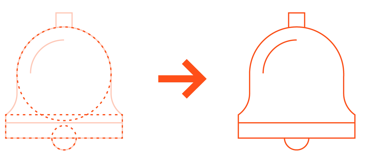
Geometric shapes in icon design

Geometric shapes work very well for constructing icons. Using these shapes as the underlying frame creates a clean and cohesive design. Use commonly used shapes like squares and circles to create the forms of your icon instead of tracing or creating an image by drawing free form. Handrawn or organic looking icons can certainly be very appealing, successful, and on-brand as well. Constructing icons from geometric shapes is one approach.
Consistency

Consistency creates a unified look and builds your brand. To create consistency, unify the visual qualities of an icon system. This can be achieved by having all of the same stroke weights and using the same visual hierarchy in every icon. Also helpful for consistency is using a consistent color palette or color application throughout the icon set.
Metaphors

Being creative and using metaphorical imagery to represent the message conveyed in an icon design can make your system distinct, clever, and enjoyable for the user. However, metaphors can have a different meaning in different cultures or may not exist altogether. So make sure your metaphors hold up for everyone in your audience.
We design many icons for a variety of clients. The styles vary from fun and playful, to clean and constructed. An example that our design team had a lot of fun with was the icon set for the McGovern Institute.


