As a design agency, our clients often ask us about color basics, how we choose certain colors and what colors go together or may clash. Here are some color basics that you might find helpful:
Additive and subtractive color basics
Additive

This model is based on the mixing of light. The three primary colors of this system are Red, Green, and Blue (RGB). When we see color created by any light source – like a TV, or computer monitor, or a projector – the three colors mix together at different levels to create every other color. When Red, Green, and Blue are all mixed together you get pure white. When designing for web or mobile, since the final outcome will be a screen, we work in this RGB mode.
Subtractive

This model is based on the mixing of pigment. From finger painting to magazine prints, any color that is on a physical surface follows this color system. Traditionally, particularly when thinking in terms of painting, the primary colors are Red, Yellow, and Blue. Most painter’s color wheels would follow that system. However, with the advances in printing technology the Cyan, Magenta, Yellow, and Black (CMYK) system provided more options for printers. To avoid any confusion Black is referred to by the letter ‘K’ so as not to be mixed up with Blue. When designing for anything that will be printed (magazine, posters, banner etc.), it is important to set up your workspace in CMYK.
The color wheel

Sir Isaac Newton created the first color wheel based on spectral hues and the mixture of lights. Today, we mostly study the color wheel from the subtractive method. It is an arrangement of hues in a chromatic manner that makes it possible for us to understand the relationships between colors.
Primary colors

The three primary colors are Red, Yellow, and Blue. They cannot be formed by the mixing of any other colors and by mixing them you get all other colors.
Secondary colors

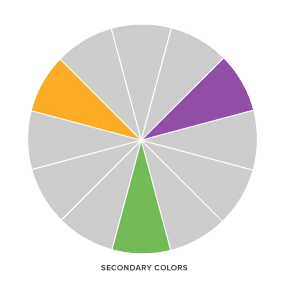
These are the colors that are produced by mixing neighboring primary colors.
Red + Yellow = Orange
Yellow + Blue = Green
Blue + Red = Purple
Tertiary colors

By continuing the mixing process, but now including the secondary colors, we arrive at the tertiary colors.
Color schemes
Color schemes are established systems that can come in handy while choosing colors for a project. Designers chose to use a specific scheme depending on the desired effect they want the colors to have.
Complimentary colors

This is a set of two colors that lie directly opposite each other on the color wheel. These colors produce a very high contrast effect. For example, the complimentary color to Orange is Blue.
Analogous colors

This is a set of colors that lie right next to each together on the color wheel. These colors create a smoother and calmer combination. Typically, one color out of this scheme dominates and the other colors support or accent it. Orange-Red and Orange-Yellow create an analogous scheme with Orange.
Split complimentary

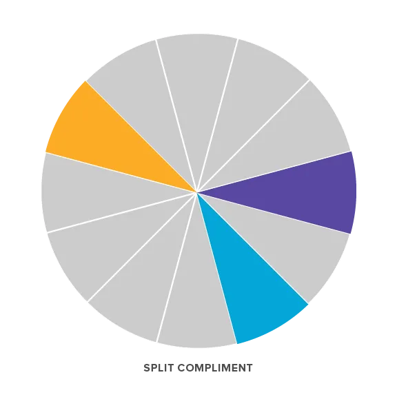
We like to think of this as a combination of the complimentary and analogous schemes. This color scheme has a similar high-impact as the complementary color scheme but is a little more harmonious like the analogous scheme. A split compliment is formed by one color and the two colors on either side of its compliment. In the case of Orange, its compliment is Blue and the two colors on either side of Blue are Blue-Purple and Blue-Green. In this way, Orange, Blue-Purple and Blue-Green form a split compliment.
Triadic

These colors lie evenly spaced out and can be located by creating an equilateral triangle through the color wheel. This scheme tends to be vibrant and dynamic and it is usually a good idea again to use one as a dominant color and the other two as supporting colors. Orange, Green, and Purple form a triadic color scheme.
Shade, tint and tone

Another way to get more variations of a single color is to add black, grey, or white to any color on the color wheel. Each color on the color wheel is a specific hue. When the hues are modified in this manner, they become desaturated and they lose some dominance or intensity of that specific hue.
Tint
Tints are formed when a percentage of white is added to a hue. This lightens and makes a hue paler. This does not mean that the color gets brighter because the adding of white also has a desaturating effect.
Tone
Tones are formed when a percentage of grey (black and white) is added to a hue. This tones down or dulls the intensity of a hue. Since both black and white are added to a hue in this situation, tones tend to have more complex qualities.
Shades
Shades are formed when a percentage of black is added to a hue. Shades tend to be darker and more intense than the original hue. Depending on the amount of black added, the color can be just a little darker that the original hue or very dark and almost black.


