The project
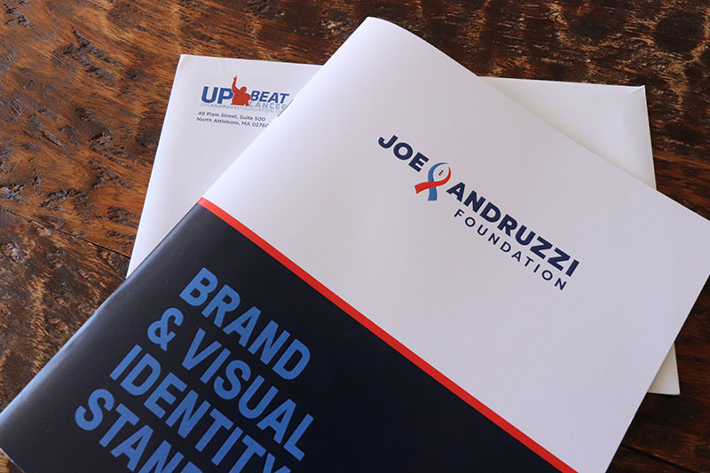
We were asked to design a new logo for the Joe Andruzzi Foundation. Joe and Jen Andruzzi, long time clients of Opus Design of Boston, needed to refresh their brand in time for their 10-year anniversary.
The client
The Joe Andruzzi Foundation brings financial assistance to cancer patients and their families, to allow them to focus on recovery. Former New England Patriot, Joe Andruzzi, and his wife Jen founded the non-profit in 2008 after Joe battled and beat cancer.
Design challenge and approach
Lily Robles, Creative Director, began the project by interviewing several groups of stakeholders familiar with the organization: the foundation team, members of the community, and donors. She wanted to understand:
- what did they like about the current logo
- what were their expectations of the brand
- what message did the existing logo communicate
- what should it communicate
- are stakeholders open to the possibility of a new logo.
One of the most consistently mentioned challenges of the existing logo was that the hierarchy and wording were misleading. Donors would make checks out to “Up Beat Cancer”, instead of “Joe Andruzzi Foundation”. In addition, the existing version was not scalable and the silhouette needed to be simplified. Almost everyone interviewed agreed that the logo needed a redesign.
Everyone agreed that there should be a connection to football, and the typeface should be modern, upbeat and bold. Joe and Jen believe that an upbeat attitude and staying positive is key when it comes to dealing with cancer. Like Joe with his battle with cancer, they want to inspire strength, hope, and optimism. All of these were brand attributes and criteria for the redesign.
Opus Design knows that it will take several options and iterations for a new logo to be finalized, and doing appropriate research really helps guide our design.
The color on the ribbon in the new mark was a challenge. Using one color was confusing as to which cause might be represented, whereas the combination of blue and red created something unique and is not tied to one cause. Art director Ellery provided the client with several choices, and here is the final result, with the old logo shown behind it:
A few key traits of the new logo are:
- the friendly, strong typeface
- the lock-up interrupting the type, which is an evolution of the old logo
- the mark that carefully combines cancer and football
After much research and creative design work, Opus was able to give Joe and Jen a meaningful new logo to help them continue doing their amazing work for decades to come.