A trip in the Opus Design time machine:
A few years ago, Opus expanded our studio space here in Cleveland Circle, Boston. To celebrate the occasion, we had a bunch of friends and clients over to celebrate the renovation. In addition to sushi, empanadas, drinks and “16 Candles” showing in the conference room, we created an interactive infographic for guests.
How do you make an interactive infographic?
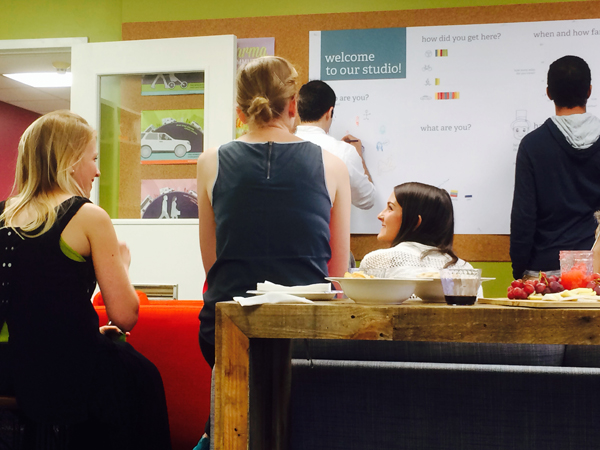
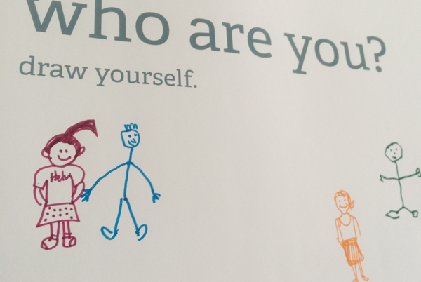
Here’s how we did it. Ellery designed a 90″ by 40″ infographic poster large enough for people to use markers and stickers to plot their “data.” We thought about the different types of information that would be easy to answer and fun to capture. Then, we invited guests to draw a picture of themselves, show us how they got to the studio and the distance they traveled. We asked them to show their connections to people; opus designers as well as other guests. We asked them to categorize themselves as client, family, friend or pet (sadly, the 2 we expected were no-shows). This resulted in a variety of bar charts, scatter plots, one big spider graphic, and lots of lovely little drawings. It was really fun to share what we do as infographic designers and get people to experience it for themselves!
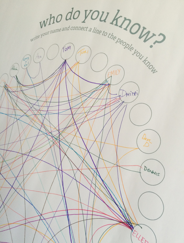
Spider/cluster type infographic shows connections between guests.
Stickers were used as “fill-patterns” for this bar chart. Self-reporting here may not have been too accurate.

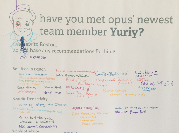
This part is asking folks to meet our new developer, Yuriy and offer some advice about Boston. Guests listed their favorite restaurants and free activities in the city. They also gave him a new dapper look.
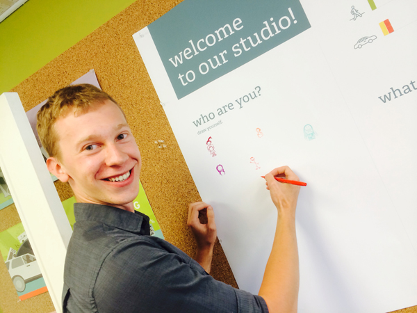
And here’s Yuriy!
Watching the boys.
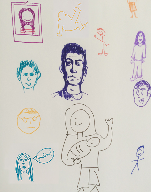
Awesome self portraits.
My favorite (me and my husband mike)
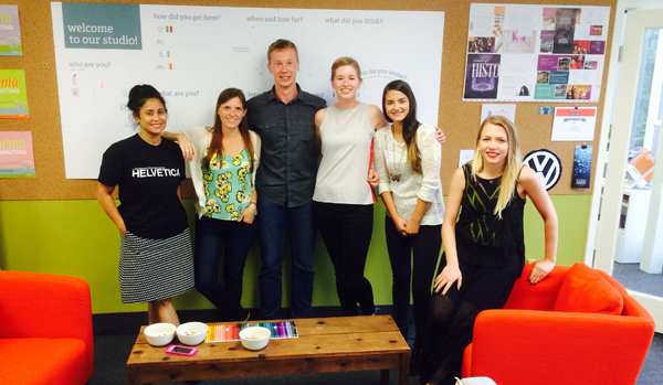
The new team.