Our Boston creative design agency works on a lot of website redesigns. For all our projects, we like to ensure that our clients receive quality graphics that look clear and professional. So, we optimize images for the high-resolution retina screen displays. These have become popular in recent years, in particular with most of Apple’s products.
Pixels and resolution
Images on a screen are made of colored squares called pixels. The resolution, or clearness, of an image, is defined by the number of pixels across the width and height of the screen.
Retina screens display smaller and closer pixels than standard screens. They also require twice the pixels to display the same image quality as a standard screen. This results in higher resolution and higher quality images. See the below images to illustrate this:

Designing for Retina displays
Raster Resolution
Although the guideline for designing with standard displays is 72 pixels per inch, the recommendation for retina optimization is 200ppi. An image with a lower resolution appears fuzzy or pixelated. Low-resolution images are difficult to work with and make work appear unprofessional or sloppy.
 Vector images

Whenever possible, our graphic designers recommend you use .svg files for images on the web, for icons and buttons for example. Those are vector files, resolution independent, look crisp on any screen, and are small in file size.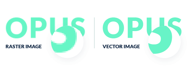 Before committing to an image for the web, check that the resolution will be large enough at the size at which it will be reproduced. Designing for retina screens is a must to ensure that all work looks professional and polished.