Deciding on the right color palette for a design project is not as straightforward as it may seem.
There are many factors that come into play when choosing the right palette that make it more complex than just choosing colors that go well together. In publication design, for example, when designing a report or a brochure, you have to consider colors that will work across the board. With so many design elements in a report (i.e. cover, charts, infographics, titles, sidebars, etc.) the color palette is crucial to readability and interest. Learn more about publication design.
Here are just a few things a designer must consider when choosing a color palette.
- Consider the brand attributes and styleguide.
If the client already has a brand styleguide, then you must consider these colors when deciding on a color palette for the project. If their logo uses color, start with those colors and build from there. This will create a nice continuity between the client’s existing brand and some new, complementary colors.
It is important to select colors that express the brand attributes, a list of adjectives, to communicate the appropriate look-and-feel strategically. If you want to convey a calm, trust-worthy, reliable mood your color palette needs to be very different from a set of colors expressing fun, energy, and excitement. - What colors will be appropriate, interesting, and communicating the brand attributes?
In a color palette, there are usually one or two mainly used colors with additional pop/secondary colors. This helps to not overwhelm the viewer with too many colors but add some interest. Typically, the primarily used colors will be a bit quieter (as they are the dominant colors seen throughout) and the pop colors will be brighter or louder. If the balance isn’t found, the design can either appear boring or contrarily, too busy. - Are there traditional colors used in the client’s industry? If so, can they be livened up?
In any particular industry, you might see a theme of colors. Many conservative businesses will gravitate towards blue and perhaps an environmentally focused business will insist on using all greens. By including a pop color in your palette, these more traditional colors can be enhanced. If you’re too rigid in sticking to all one color, then the content will not come alive. - Consider the psychological and cultural connotation.
If you are trying to conjure up a particular emotion in the design, you may want to investigate the psychological meanings behind colors. While different people may have preferences or reactions, there are general associations for every color. However, if your report is geared towards a specific culture, you may want to cross reference the cultural connotation as well. For example, white is typically seen as a color of lightness, happiness, positivity and purity. However, in many Asian cultures, white is a symbol of grief and is traditionally worn at funerals. - A color palette generator can be helpful.
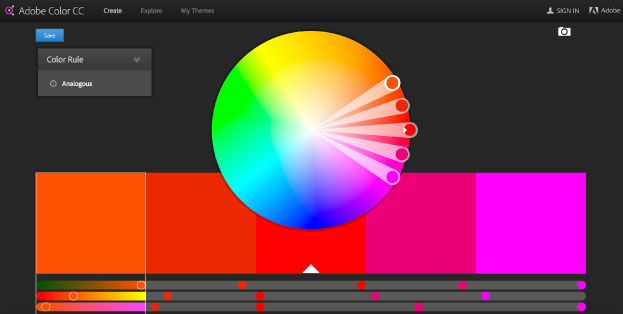
There are so many color palette generators and inspirational pages out there, it can get a little overwhelming! Adobe Color CC is a great generator that helps you to create palettes based on color rules (analogous, complementary, etc.) or you can just explore the seemingly endless color palettes to gain some inspiration. Another cool feature, is that you can upload a photo and the generator will choose colors from that photo to create a “color mood.”
Adobe Color CC Palette Generator - Take the palette of your photographs into consideration.
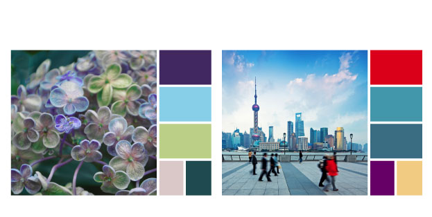
Sometimes in publication design, whether doing brochure or report design, you may have to incorporate a great deal of photographs. The last thing you want is for your color palette to fight with any imagery you have in your design. Look at your photos, is there a common theme of colors among them? Even just one color that can integrate well with all of the photographs will help to create cohesion in the design.Examples of colors being sampled from a photograph.
Finding the right color palette can be tricky, but it’s also a great deal of fun! Next time you’re reading a brochure, annual report, magazine, or poster, take time to notice the color palette.