Earlier this year, one of our website designers had the opportunity to take a Website Accessibility course offered by the American Graphics Institute. At Opus, our website designers are always continuing to learn more about accessibility best practices so we can offer high quality and accessible web design. The 1-day course covered the basics of accessibility on the web; including the guidelines/laws, the tools used for testing accessibility, and accessible design best practices.
The class covered a lot of important information but here are 6 highlights!
Highlight One
An accessible website benefits everyone, not just people with disabilities
The primary reason we design and build accessible websites is so that everyone, no matter their ability, can access and use your website. However, an accessible website really benefits everyone visiting the website. Below are two lists of how an accessible website benefits all users as well as the website owners.
Benefits of accessibility for website users:
- Bandwidth issues/slow internet: If someone has a slow internet connection, then the images on a website may not load. If it’s an accessible website, there will be alternative text, “alt text” for each image that describes what the images are depicting even if you can’t see them.
- Challenging Environment: If someone is browsing a website outside on their phone, and the sun is causing glare on their screen, if the website’s text has enough color contrast, they will still be able to read the text. Another example of this is if someone is watching a video online but they are in a public space and needs to have their volume off, by having closed captions, the person watching the video can still understand what is being said in the video.
- Eye Fatigue: If the text on a website has enough color contrast against the background for accessibility, this can also be helpful in reducing eye fatigue.
- Improves Search Engine Optimization: Having accessible content and alt text can help improve a website’s SEO, so users can find what they’re looking for easier.
- Easy Navigation: If a website has an accessible and easy-to-use layout, it will make it easier for everyone to navigate and find what they need.
Benefits of accessibility for website owners:
- Improves Search Engine Optimization: This is also helpful for website owners so that users can more easily find your website.
- Reflects positively on your company: Having an accessible website shows that you care that everyone can access your website.
- Cost Saving: Having an accessible website means no lawsuits in the future as well as no additional cost for adding accessibility to your website later on.
- Provide a high-quality user experience: Having an accessible website provides a better experience for everyone visiting your website.
Highlight Two
WCAG is a comprehensive tool for website accessibility
The Web Content Accessibility Guidelines (WCAG) is a compilation of all web accessibility requirements around the world, so if you’re compliant with the WCAG then you are within the requirements of the law.
Different countries have their own laws on accessibility
If you’re a global company, your website will need to meet the requirements of all the countries it will be accessed in. As long as you follow the guidelines in the WCAG, you’ll be compliant everywhere!
Highlight Three
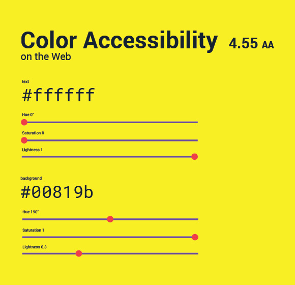
Besides color needing to have enough contrast, color alone cannot be used for context
One of the easiest ways to make your website design more accessible is to make sure that all text on your website has enough color contrast against the background in order for it to be easily read by everyone. Learn more about color contrast.
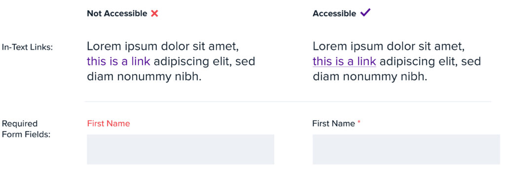
Another important thing to keep in mind when designing an accessible website is to not use color only to provide context. For example, an in-text link shouldn’t just be indicated by color, it should also have an underline. This way if someone cannot see the color shift, they will still see the underline and know that it is a link. A second example is when indicating a required form field, it would not be accessible to only display the form field label in red. If someone is color blind they will not see the red text, but if you include a red asterisk after the field label, then anyone will be able to see the symbol and know the field is required. See the below for both examples:
Highlight Four
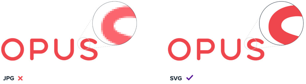
SVG files are good for accessibility
For people who use a screen magnifier, when they zoom in on an SVG file the image is still clear. This is very helpful if you have an image that includes text. For example, a JPG or PNG of a chart with important figures and text on a web page, if zoomed in, would appear blurry and not legable. If the chart is saved as an SVG, when someone zooms in on the image they would still be able to read the figures and text. This is because SVG files are Scalable Vector Graphics and will appear clear and vector-like at any size. See the below example of the Opus logo:
Highlight Five
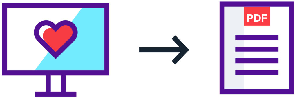
Accessible PDF’s
If you’re linking to a PDF from your accessible website, the PDF should ideally be accessible as well since it’s a continuation of your site.
Highlight Six

What about mobile accessibility?
WCAG is developing updated requirements and more specific guidance on mobile accessibility. So for now adhering to the WCAG guidelines for desktop applies to mobile. But we will be on the lookout for specific guidance in the future!
As website designers, we love expanding our knowledge on accessibility so we can create the best, accessible websites for our clients. Let us know if you’re feeling inspired and want an accessible website, we would be happy to help!