The client
Westcoast Fresh – has a farm to market philosophy, that brings fresh fruits and vegetables to markets. While this post focuses on their sub-brands, their website is beautiful. Watch out though it will make you hungry for fresh amazing produce.
The project
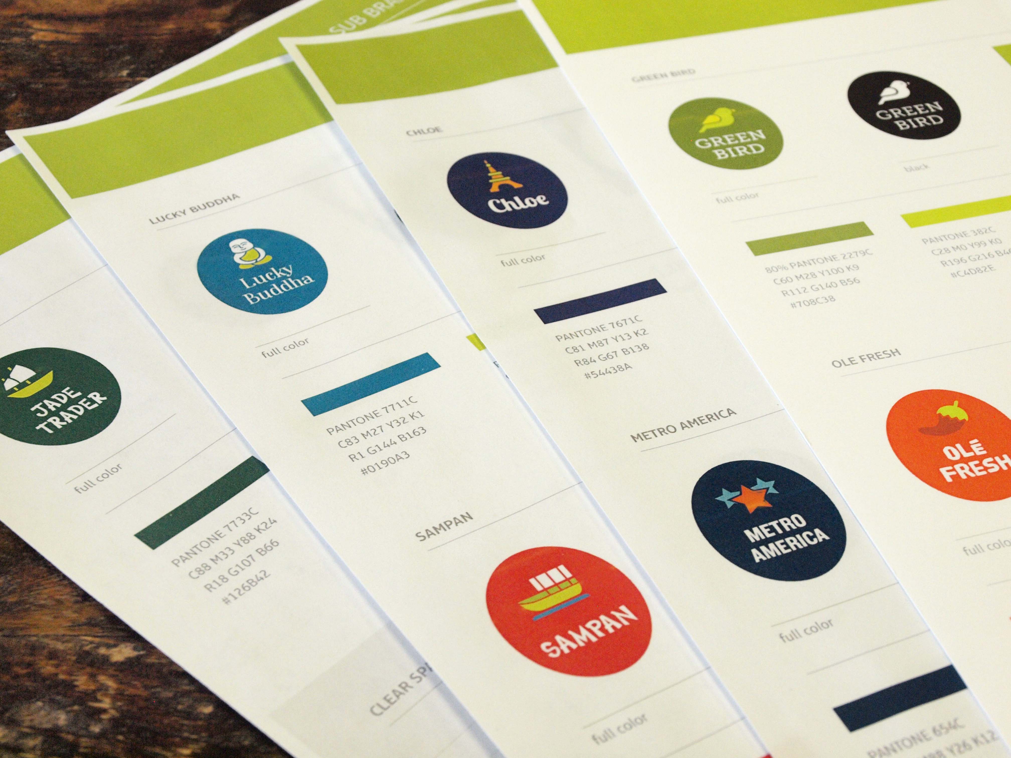
Our design work with them started with not only a rebrand of their logo, but also a total rebranding of their 7 produce sub-brands. Westcoast Fresh wanted a brand and logo that represented their commitment to the planet, their growers, the produce and their customers. The sub-brands should be recognizable to their audience and promote brand awareness.
Design challenge and approach
The challenge was creating consistency across so many logos. The main logo is simple, fresh and appealing to customers.
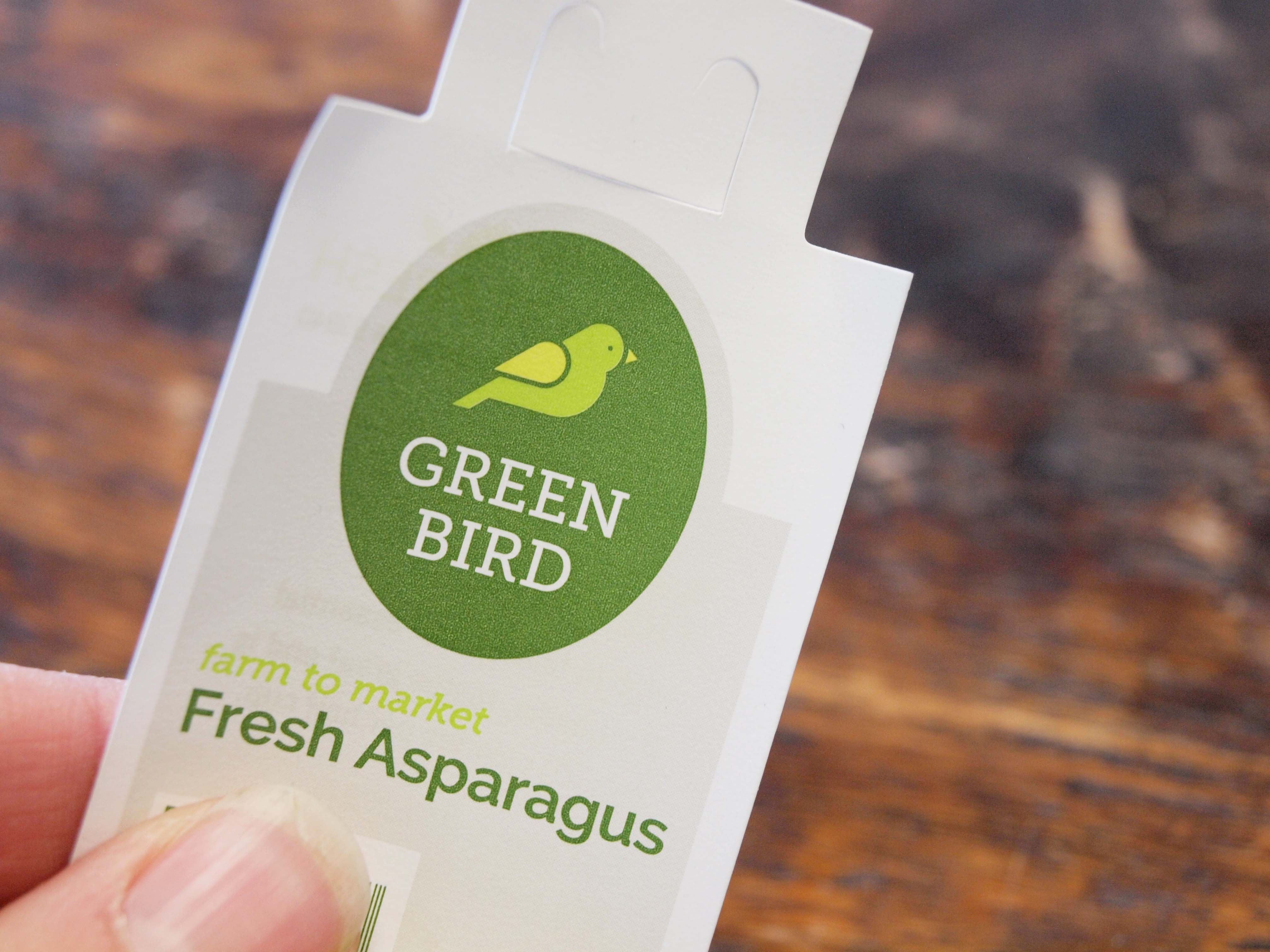
Opus Designer, Casey McGee, wanted the sub-brands to be just as enticing, but hold together like a family and be able to stand alone. She created a container, an oval, to be the constant throughout the sub-brands. The type and picture within the oval gave each sub-brand their individual personality, while still being consistent to the brand. Each sub-brand was given a color pallette of about three colors from the style guide. Staying within the style guide with a consistent container is what holds this branding together.
Our design company gave Westcoast Fresh, a vibrant company with intentionally grown produce, logos that represent that.


