Walnut Hill School for the Arts Print Materials
Walnut Hill School for the Arts is an independent high school located in Natick, Massachusetts offering unparalleled training in dance, music, theater, visual art, and writing, film & media arts. In 2017, Opus was hired to provide creative services for this independent school supporting advancement, admissions, and other ongoing design needs.
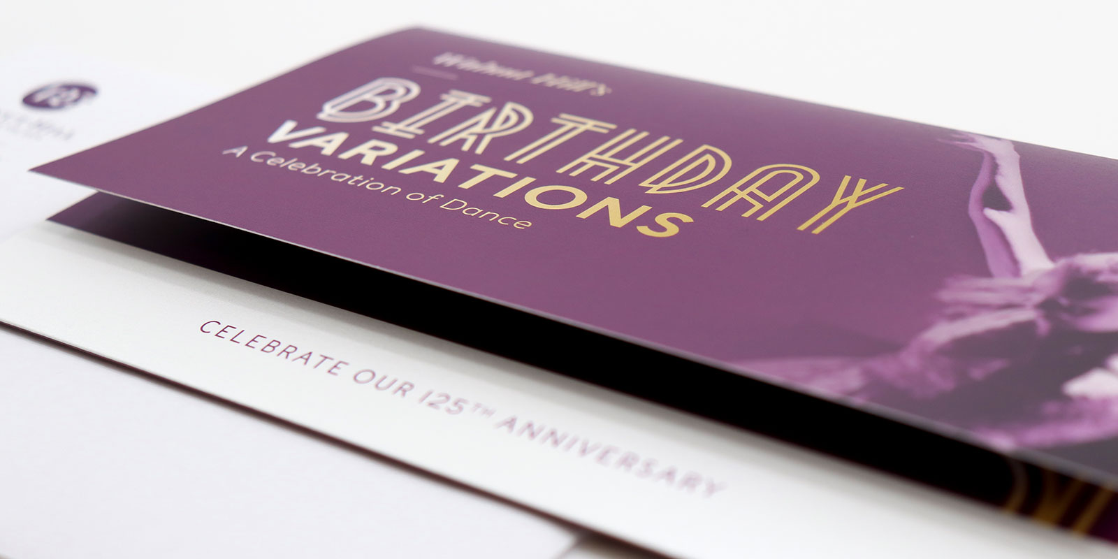
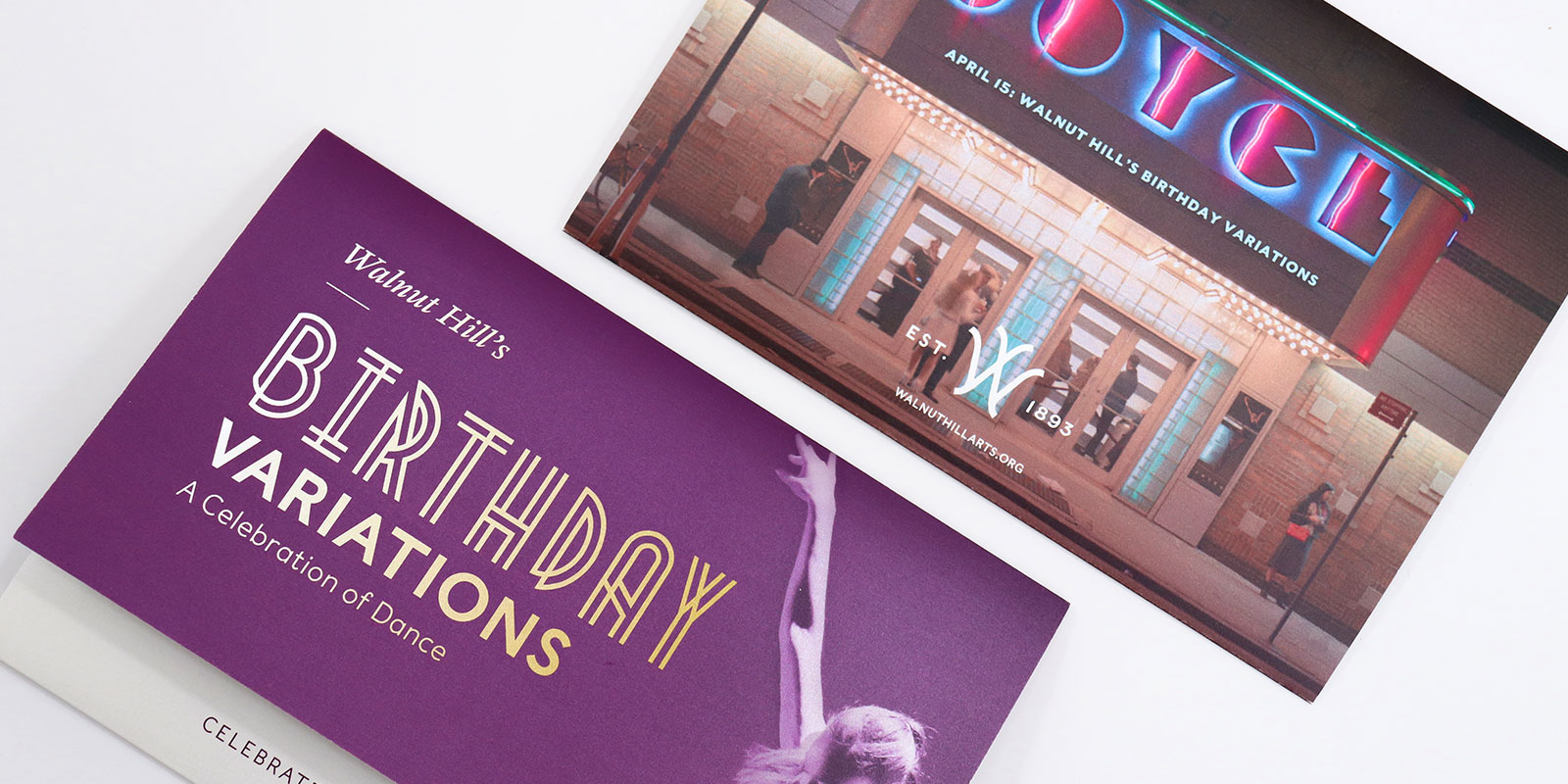
Celebrating a 125th Anniversary
Founded in 1893, the 2018-2019 school year marked Walnut Hill’s 125th anniversary. To celebrate the past 125 extraordinary years, the school hosted a variety of birthday events throughout the year. Having worked with Walnut Hill on numerous projects over the past 3 years, we were very excited to have the opportunity to help them prepare for this huge milestone.
A Celebration of Dance
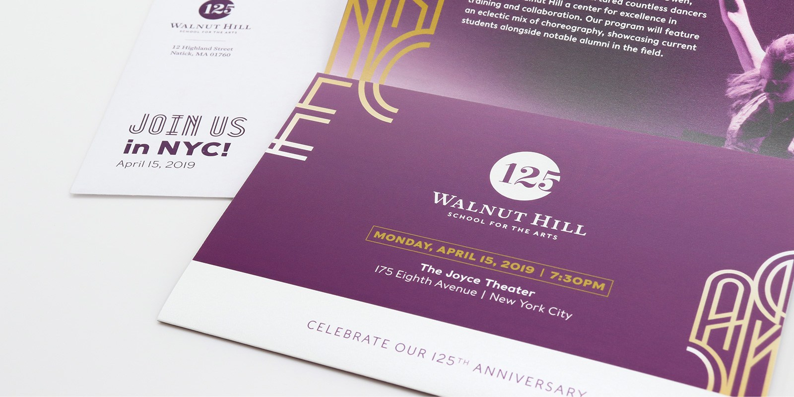
As part of Walnut Hill’s 125th Anniversary, they held a celebration of dance at The Joyce Theater in New York City, showcasing both current students and notable alumni in the field, all of whom were nurtured in the incredible and collaborative Walnut Hill dance program.
Architectural Inspiration
Inspired by the beautiful art deco signage on the front of the venue, we leveraged this style throughout the invitation in the typography and in the design elements we created.
Adding Some Shine
It’s not every day that you turn 125 years old, so we wanted to make sure this invitation felt really special! We chose a pearlescent paper to print both the invitation and the reply card on. The paper added just the right amount of glitz to the design, sparkling when light is reflected off of it.
Admissions Package
A prospective student’s acceptance into Walnut Hill is a pivotal and thrilling moment that we wanted to meet with a thoughtful and memorable admissions package.
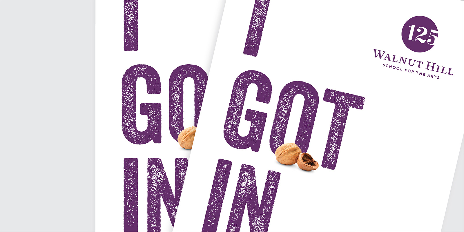
Creative services for an independent school is exciting because there is a lot of variety. The goal for the packaging design was to let students know they have been accepted, get students excited about attending the school, and to get them to sign up to one of the accepted students days.
The graphic design needed to be cool and branded in an interesting way to engage a young and creative audience.
We created a fun poster design that would allow students to share their “GOT IN” news on social media. Students at Walnut Hill are called “Walnuts” so we wanted to help them start to self-identify by featuring the walnut imagery.
Considering the User Experience
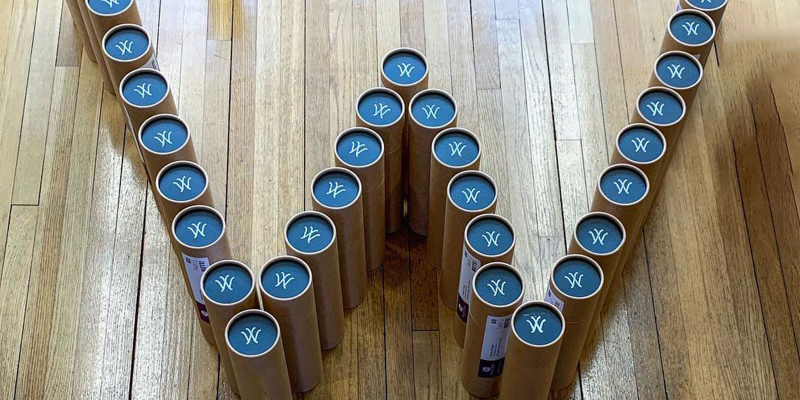
For the package design and delivery, we chose a beautiful craft cardboard tube with black caps to ship the admissions materials. The tubes themselves were on-brand: bespoke, warm and human, a keepsake box. We designed a simple, inexpensive white rubber stamp of the Walnut Hill “W” which was used to brand each admit package by hand. And since this was not your average box or letter, we took a sample to the US post office to make sure there would be no issues putting them in the mail!
Major Brochures
Helping Students to Choose the Right Major
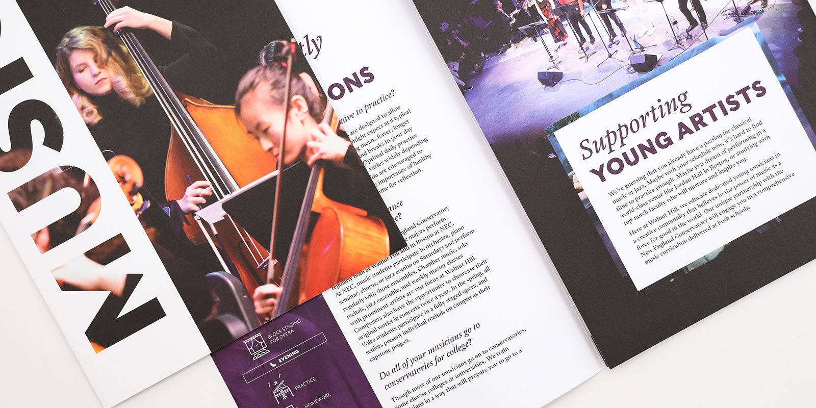
When students become aware of Walnut Hill, they understand that it is an art school but oftentimes they are not sure if they will find the discipline they are looking for. The admissions team strives to give equal attention to all the majors vs just the ones that tend to be the most popular.
For open houses and tours, we needed to create an engaging brochure design for each major so a student could see what it would be like to be a writing major for example, and not have to read about ballet auditions. They could learn about a day in the life of a writing major, see what kinds of classes are offered, and how to apply.
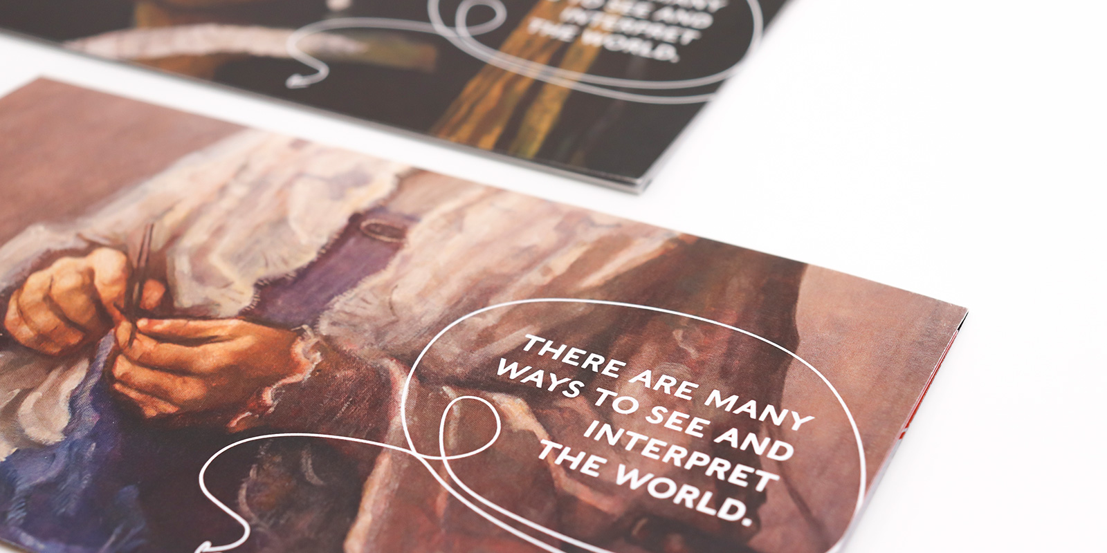
Annual Giving Direct Mail
We worked with the advancement team at Walnut Hill School for the Arts to design an award-winning series of 3 direct mail appeals. The concept was to speak to the founder’s forward-thinking approach by combining traditional portraits of the founders with sketches of contemporary gadgets.
Combining History with the Present
The founders’ portraits are something that students see every single day. The tri-fold design used these familiar paintings on the front of the mailer and when the reader opens the piece, they see the portraits presented in an unexpected way — with illustrations of sunglasses, fidget spinners, bubble gum, and ipads. The illustrations were created with a hand-drawn style to speak to the imaginative and creative environment that Walnut Hill fosters.
Opus has been a great partner! They are very creative and extremely responsive — which makes them an ideal fit. They’ve created really fun out-of-the-box projects. Let’s be honest, we’ve all worked with designers who are creative but not responsive or designers who are responsive but are kind of flat design-wise. Opus is the whole package. It’s a pleasure working with them. They have helped us raise the bar on our print and digital materials.