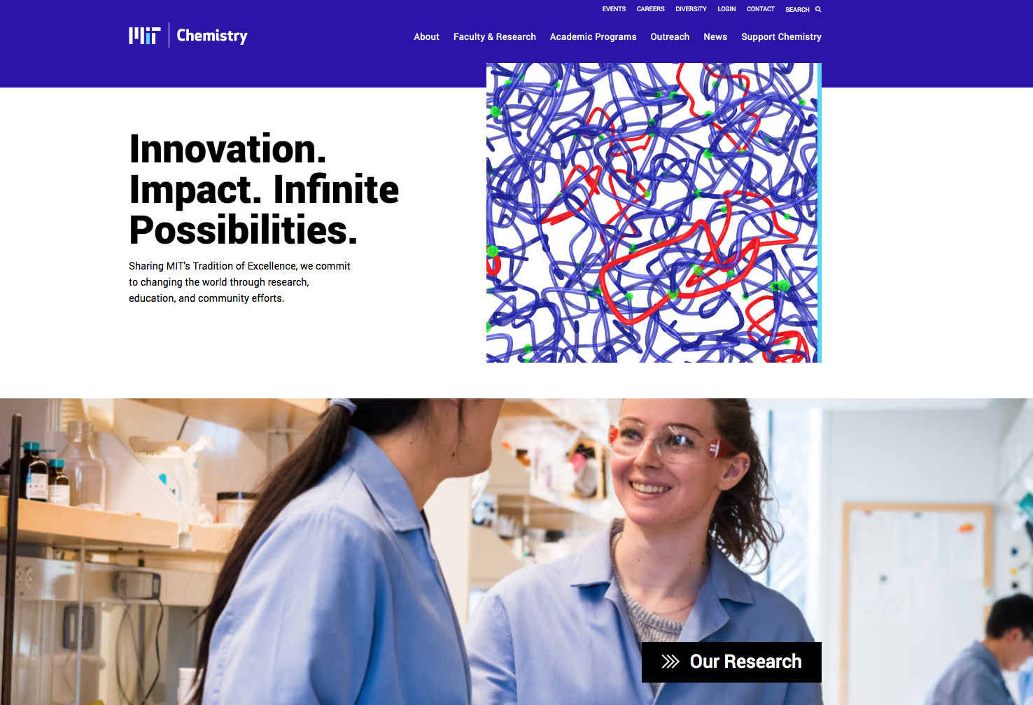
MIT’s Chemistry Department hired our design studio when it was time for their website redesign. Aside from the existing website being several years old, an accessibility audit also showed that the site drastically lacked accessibility.
The website reDesign
After the architecture for the website project is solidified and approved, it’s time to start the design phase. For MIT Chemistry, our design studio started by reviewing the UX (sitemap, wireframes and technical specifications). We had completed this in a previous phase, which included the website structure, technical and functional specifications. Once our designers had the full understanding of this and the client’s goals, we had the look and feel discussion with the team. This discussion is a good opportunity to test visual styles and approaches with the client so that we understand what feels right and works for them. We also take a look at attributes that the website should project. For MIT Chemistry some of those attributes were: welcoming, innovative, dynamic, fresh and exciting.
Often we will come out of the look-and-feel discussion with two website redesign directions to pursue. We will test opposing elements in each. For example, one design direction could show a black background on the homepage, where the other could be on white, or alternating color backgrounds. For MIT Chemistry, we tested different web fonts, color usage (muted palette vs. colorful) and in general a different design of the placement and size of structural elements.
Design Inspiration
We looked at many other chemistry-related websites to see what’s been done, what to avoid, and what works to signal chemistry. Since we wanted to take a more innovative approach to the design, it was good to learn about other chemistry-related sites. Then we pushed the design in a new direction that would feel unique to MIT. Another inspiration we used was our outsider-perspective on chemistry. This included chemical reactions, synthetic mixtures, bright colors, and radioactivity. We tried to bring a little of our preconceived notions into the brightness of the color palette and excitement using big bold titles.
Design challenges
Working with a large client team can be challenging since it’s easy to get subjective when it comes to design. Here, however, the entire MIT and Opus teams worked together to remind ourselves that the design needs to work for MIT Chemistry and not be based on personal preferences. The MIT Chemistry client team was very decisive. At the same time, they really took the time to make sure that the design decisions made sense and would work for their overall goals. In the end, it was a very smooth process for such a large group!
Our favorite part
Everyone in the Opus design studio loves working with MIT. We always learn something new and get a glimpse into the cutting-edge science and technology that’s taking place there. There is always something fascinating about the groups we work with. This definitely helps us get inspired to create something that reflects what is unique and innovative about them.
The end result
The client team is very excited about their new website. The new design and structure are a great improvement over their old site. We used a lot of backend WordPress functionality to make it easy to maintain the site for administrators and editors as well, which was one of the goals of the site.