By Julia Frenkle
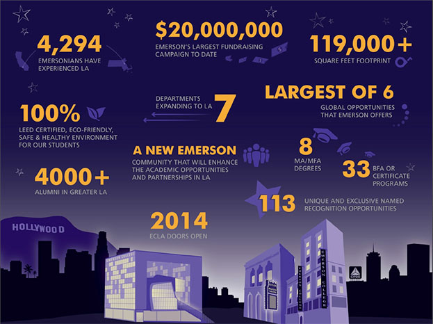
Infographics are a cool way to engage people in data or content that might otherwise be dry and confusing. But before the hand-drawn type and gigantic numbers, information graphics were simply clear, clean and compelling visuals to display quantitative information. Our experience as infographic designers actually pre-dates the popular use of the term. Today, we see fewer data and more messaging. But we know that clients need a balance of both.

Opus Design Approach
Our approach to infographic design starts with understanding the data. We want to know: What are you trying to say with the numbers? What is the insight or comparison you are trying to make? This helps us zero in on what is important and make that the focus. We also learn about other details to see how they support the main idea. All of this informs the hierarchy of the graphic.
Next, we need to learn about you and your audience. What is your relationship? What are your goals for the infographic? By discussing the message and audience we can uncover the right visual style … which can include colorful icons, or keeping it sharp and simple, or perhaps a multi-variate story with custom illustration.

Some infographics are light and fun while others are more intense and draw the reader into the graphic to hang out for a while and learn something new. It can be a bold call to action or a detailed, but accessible resource. It’s important to match the style to both the content and context. An academic presentation requires a clear, accurate diagram. An annual report requires more serious, professional tables and charts. A website requires big branding and captivating messaging on a home page. These are examples where the infographic design makes the content work for you. It’s delivered in a way that is more accessible and memorable for your audience.
Some infographics are light and fun while others are more intense and draw the reader into the graphic to hang out for a while and learn something new.
Oftentimes, clients will have some sort of PowerPoint slide which they have used to demonstrate an idea. They don’t think it works because people are confused or it doesn’t quite say what they want it to say. We’ll study what they have and ask additional questions and sketch our own sample structures for the graphic. By talking and drawing we can test the relationship between elements in the concept and see how things should fit together? Is it a sequential process with a beginning and an end? Or are they parts of a whole? Or two main themes that are being compared? This is how we translate the idea the client intended, into an infographic design.
When people ask me “What kind of design do you do?” I say that Opus does “brand and information design,” and infographics are an ideal integration of those skills.
Also, here’s a nice summary and history of infographics, also known as data visualization and information design.


