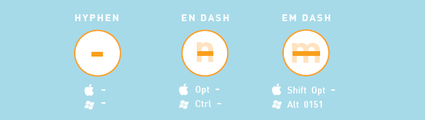
When to use hyphens, en-dashes and em-dashes
When Opus is doing a close, final review of a report or brochure, we watch for consistency in things like punctuation. We want to be consistent, and of course, we want to be correct. While you’re doing a logo design or editing a report, it’s all too easy to use dashes and hyphens interchangeably. But while the physical differences between the three punctuation marks are minor, their grammatical distinctions are important to get right. Here’s an infographic and explanation which we hope can help.
Hyphens
Hyphens are used to connect compound words to form an adjective like “snow-covered” or divide a word that breaks from the end of a line to the next. We’ll take the uses one at a time. In their timeless grammar stylebook, William Strunk and E.B. White advise the writer not to use a hyphen when a compound adjective can be written as one word. The example they use is water-fowl versus waterfowl. “The steady evolution of language seems to favor union,” they write, but use common sense, and probably a dictionary, to determine whether or not a hyphen is necessary.
When using a hyphen to divide a word between two lines, make sure to place the hyphen on the top line and at a natural syllable break.
Ex: Here at Opus Design, we place a premium on showing our clients a qual-
ity finished product, whether it’s an infographic, website, or report design.
Sometimes clients prefer to remove these breaking hyphens from paragraphs, but it can be tricky because without hyphenation a paragraph is susceptible to what we call rivers — see our post about rivers!
En-dashes
The en-dash (–) is longer than a hyphen (-) but shorter than an em-dash (—), and is used to indicate range by spanning time or quantities. For example, you’d use an en-dash in the following sentences:
The 2014–2015 fiscal year was one of Opus Design’s most successful.
Please read pages 16–20 and answer the questions at the end of the chapter.
There’s something to keep in mind, however, when deciding whether an en-dash is appropriate: if you introduce a span or range with words such as from or between, do not use the en dash. Examples:
Correct: Between 1996 and 1999, graphic design underwent fundamental changes as a result of software advances and the Internet.
Incorrect: Between 1996–1999, graphic design underwent fundamental changes as a result of software advances and the Internet.
also,
Correct: From 2000 to 2010, the field of information design grew by leaps and bounds.
Incorrect: From 2000–2010, the field of information design grew by leaps and bounds.
Here are the keystrokes you need to make an en-dash:
Mac: option + hyphen
PC: CTRL + hyphen
Em-dashes
Em-dashes are used to break a thought—they’re the longest of the three dashes. Or they are used—with an opening and ending dash like this—to add a thought in the middle of a sentence. If you want to set a thought apart and bring attention to it, use an em-dash. Strunk & White put it this way: “A dash is a mark of separation stronger than a comma, less formal than a colon, and more relaxed than a parentheses.” Examples:
We love what we do and are committed to creating fresh, effective and even award-winning design for our clients—design that translates complicated concepts into beautiful and simple infographics.
When revisiting your company’s corporate identity—a periodic task that is crucial to a firm’s success—experts agree that seeking outside support makes for a smoother rebranding process.
Here are the keystrokes you need to make an em-dash:
Mac: shift + option + hyphen
PC: ALT + 0151
We’re being detailed—let’s go for it.
Please note that the em-dash should not have spaces before or after. However, with certain fonts, the letter and em-dash are so close they seem to touch and that is too close for many of our clients. In these situations we employ a hairline space on either side of the em-dash.